
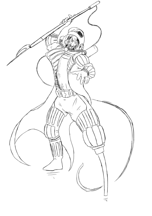
Capturing Moebius’ Style:
The purpose of this drawing was to see if I could replicate the feel of Moebius’ colouring style which I feel that I succeeded in for the most part. I think I managed to capture the vibrancy of colour that is present in Moebius’ work using more saturated and deep hues of colours than I normally would, for example a more reddish salmon pink instead of a more pale flesh tone and an even deeper red-pink colour for his scar which would normally be a paler version of the skin colour. I tried my hand at some of Moebius’ line shading around Ahab’s eyes and I am pleased with the results. The broken line shading mixed with the deep purple colour I chose for around the characters eye sockets really brings forth the haggard and worn look I had always thought Ahab would have, it also helps the character seem brutally and savagely focused. Despite being happy with the outcome of this piece there are still areas of this style that I did not touch on here that could be beneficial to me. Moebius’ seems to be fond of using colour gradients in his work, slowly transitioning from one colour to another. This piece of work does look a bit flat and the use of colour gradient, for example a darker purple under the eyebrows fading into the current colour or a lighter pink at the top of the face fading down into the skin colour I chose, might add to the sense of depth and if not at least add some more visual interest. Using a second darker tone of the colours I’ve used to colour in areas that have wrinkles or shadows would also add to this and still fits with Moebius’ methods.
The Harmony of Colours Used:
Making this piece look cohesive was one of the goals I had in mind, since despite his use of bright colours Moebius’ pieces are always united and grounded, everything feels like it belongs and nothing looks jarring. I think I succeeded when it came to the skin tones but less so with the hair and the colour of his shirt. The grey parts of his hair I’m fairly happy with but the colour of the brownish hair doesn’t really fit as well as I’d like. It feels like it should be more subdued and closer to the grey in its saturation. This would mean that the eye of the viewer would be drawn straight to the face and make it a stronger focal point. The yellow of the shirt just seems off to me and is possibly too far a departure from the dark and brooding aesthetic of the rest of the character perhaps a dark orange would have worked better and would have stuck closer to that aesthetic.
Moving forward I feel like I need to do more of these style tests and work on the elements of Moebius’ style that I did not focus on as much for this piece. I also want to do some more research into colour theory to aid the unity of my future pieces that use brighter colours.


.JPG)